All examples
Visualize Precinct Election Results
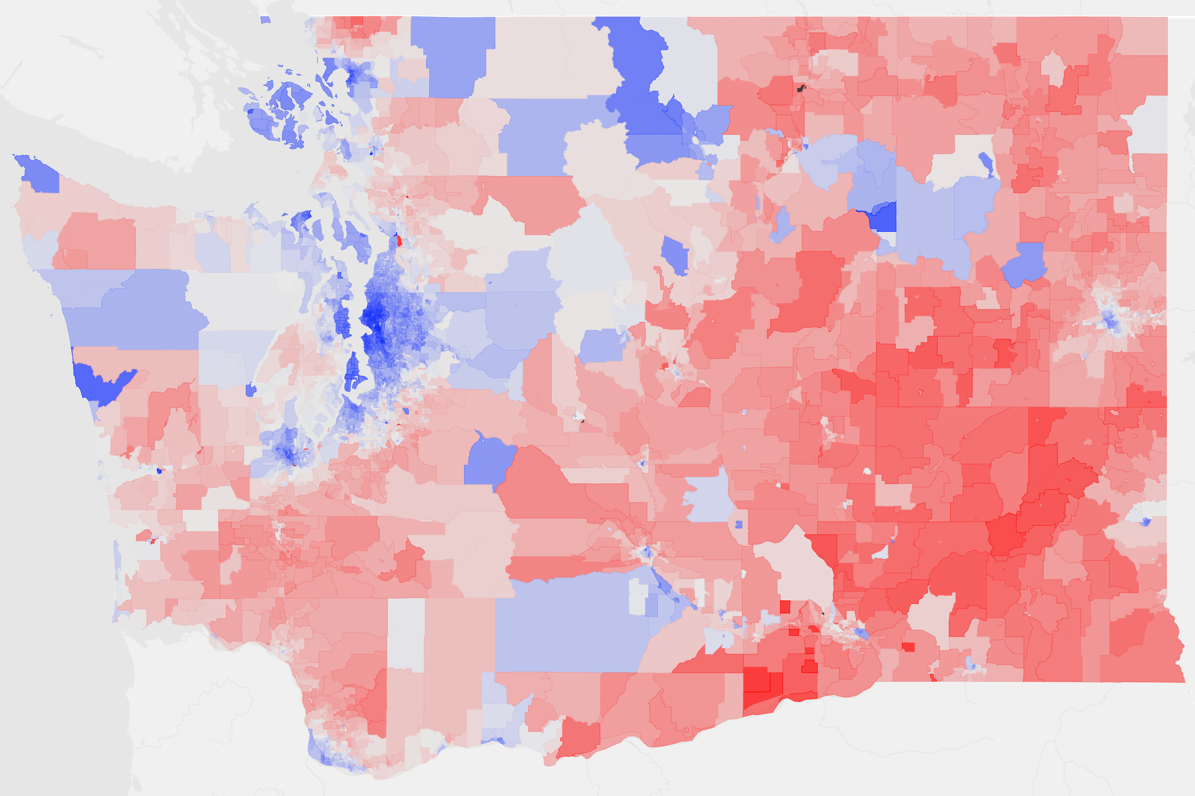
Precinct-level maps reveal patterns that disappear at larger scales. Apply a diverging color ramp to highlight margins of victory and produce an election graphic that is clear, familiar, and ready to publish.
Dataset
Ideas to explore
- Color by 'pct_dem_lead'
- Use the Political palette
- Reverse the color scale
- Export as SVG for publication
Ready to try it?
Create a new map, load the source data, and use this example as a starting point for your own editorial or design project.