All examples
Compare Population Around the World
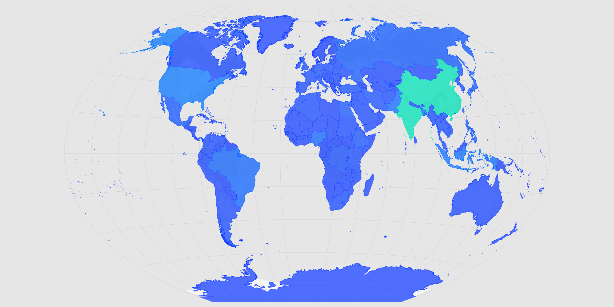
Choropleth maps are one of the clearest ways to communicate geographic trends. Start with Natural Earth country boundaries, apply a continuous population scale, and experiment with projections that best support your message.
Dataset
Ideas to explore
- Color countries using 'POP_EST'
- Try different palettes
- Compare world projections
- Export clean SVG or PNG graphics
Ready to try it?
Create a new map, load the source data, and use this example as a starting point for your own editorial or design project.